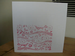
The George flag for card 1
items used
stamp - hero arts - birds and branch - ink my stash
then some pearls just for little bit of bling
Not sure if this needs a message or not ? - let me know what you think
--------
and card 2 for the union jack
Spellbinder label die
Tim Holtz - cordations card stock
Ribbon and button - my stash


9 comments:
Two cards at once this week Nicky... and you have displayed both flags, superb!
The first on is a very pretty stamp and I like how you have added the pearls to the flower centres.
It's a pity that the DST shows through the organza ribbon on the second one... I usually just attach it behind with a little snail tape. You can always cover it with another piece of paper so that it doesn't show inside.
It's a pretty design, maybe a white oval on the blue Nestie under the button would just lighten it slightly.
They both look super however!
Thanks so much
Chrissie
Lady LIM
"Less is More"
Two great cards, the first one is so pretty and elegant, and the second is so bold and vibrant.
Two lovely cards
Beryl x
two great cards, love the red & white one best.
Two lovely cards, Sandra
Two super cards, great bird stamp and I like the layout of the second. xx
Lovely cards Nicky.
I'd not have used tape under the organza, have to say. If it;s secured under that center nestie it would hold well enough
Lovely cards, nevertheless
Good to see you as always
Thanks so much
Mandi
Diva LIM
"Less is More"
That red and white is lovely, very simple and elegant
Anne
x
Two very nice LIM cards! Well done!
Greetings,
Charlotte
Post a Comment